Importance of Typography and How it Impacts Design
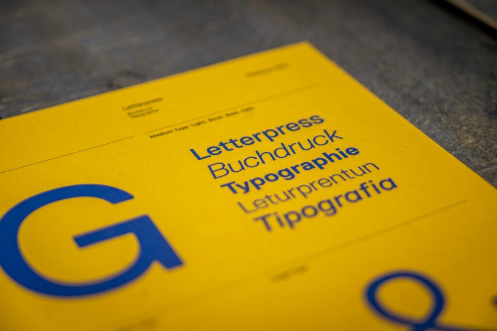
Discover the importance of typography and the reasons why every modern designer understands this centuries-old art. Perhaps a picture speaks a thousand words. However, text in graphic design is just as important as the imagery it is placed beside. It takes skill to include words in a design without having them compete with or overpower the other visual aspects. It’s known as typography, and there’s no denying its significance in graphic design. What is typography? Typography is the deliberate use of type to improve the readability and aesthetics of written content. Typography is one of the most important abilities that each graphic and internet designer must acquire. It is crucial in all print and digital design processes. Typography has two purposes in graphic design. The first is to increase readability, and the second is to help convey the meaning, tone, and mood of a design item. It is the skill of organizing letters and phrases so that the reader can easily read, understand, and find the content visually pleasing. Typography focuses on style, appearance, and structure with the aim of evoking particular feelings and communicating particular messages. The font brings the words to life. Moveable type was created in the 11th century, which is when typography first appeared. Typography was a specialized art associated with books, publications, and later, public works, before the advent of the digital age. The earliest typographic work was the Gutenberg Bible, which led to a typographic revolution in the West. Fun fact: Textura, the typeface that was used in the Gutenberg Bible, is available in most contemporary desktop applications’ font drop-down menus. Today The same holds true for typography in the digital age as it did for calligraphy in the past. Why is typography important? Graphic designers are visual communicators who utilize text, images, colors, and illustrations to convey ideas. Typography is what makes written messages sing in graphic design. Here are some important illustrations of how typography can accomplish more than just textual communication. 1. Increases accessibility The following typographic elements can be used purposefully to adhere to accessibility design standards and reach a much wider audience for your creations: Line and letter spacing: People with visual impairments may find it simpler to distinguish between letters and words when lines and letters are spaced properly. Contrast: Most people will find it challenging to read low-contrast color combinations, such as grey writing on a light-gray backdrop, especially those who have dyslexia or visual impairments. Instead, choose a contrast that is higher, such as black text on a white backdrop (or the opposite). Font style: Particularly in web design, simple, unambiguous font styles are easier for those with cognitive problems or dyslexia to read. Serif typefaces like Times New Roman and Georgia typically perform worse than sans serif fonts like Arial, Helvetica, and Verdana. Text formatting: Making keywords or phrases bold, italicized, or underlined can assist people with cognitive difficulties in processing lengthy texts more easily. 2. Draws attention Imagine if the message of every banner, book cover, product label, and website was communicated using 12-point Times New Roman. It wouldn’t work since every text element in a graphic design would be overlooked because they were all the same. One of the best methods to draw a viewer’s attention to design is through typography. Additionally, typography enables important information to stand out when it is vying for attention in a design with other visual elements. To create the intended appearance, designers employ a variety of typographic components, including: Font size: By using various font sizes across a typographic design, the most crucial words on the page are highlighted. Contrast: Using contrasting fonts makes some elements stand out and adds aesthetic intrigue. Color: Making use of vivid or strong colors makes important information stand out. Location: Putting key information in a visible spot on the page, such as the top of the center, naturally pulls the reader’s attention to the material that matters most. Whitespace: By purposely leaving a space around an element empty, whitespace draws attention to the text there. 3. Helps with communication A website may be about a business, a piece of art, or a particular product. When visiting a website, you can immediately tell what kind of information is provided. This is the case due to the use of typography. The way the information is arranged, the fonts and colors used, and other minor details enable communication between the website owner and the visitor. 4. Creates an aesthetic feel Choosing the right typeface is the cornerstone of effective typographic use. The typeface should be as straightforward as possible. It shouldn’t be too small or run-down. Selecting legible typefaces for presentations is essential. The typefaces make your writing easier to read. It helps readers understand the text’s material. Colors, typefaces, and text sizes may draw in your target audience. 5. Works on building moods A video game commercial is an example of content. It might have some of the game’s most intriguing components. In this situation, you ought to provide interesting, lively, and fashionable content. The content’s legibility is significantly influenced by the designer’s selection of text alignment and arrangement. The font has typically been oriented by designers in one of four ways: right, left, centered, or justified. If your writing needs to be taken seriously, use legible typefaces. How the text is read depends on the typeface used. 6. It reflects professionalism A high level of knowledge can be seen in a design project’s effective use of typography. Selecting the appropriate text type and size will increase your customers’ likelihood of believing you. Having a business-focused website will help with product marketing. The typographic design has the ability to offer design originality as one of its attributes. Your design or web pages appear pleasant or high-end, playful, serious, inviting, etc. due to the thoughtful use of fonts. You can use specific typefaces to convey your brand’s qualities. Typography is the foundation of a professional design strategy. Typography establishes the worth of the